Tr(ai)nStation
UI/UX Design & Development
overview
Tr(ai)nStation Case Study: Artificially Intelligent Personal Training App
The task was to create an intuitive, attractive and exciting interface for a sophisticated AI fitness application which would delight gym-goers of all aptitudes and walks of life.
- ClientTr(ai)nStation
- ScopeUI/UX RedesignUI DesignDevelopment

user persona
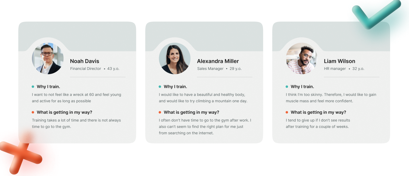
Define and study realistic user personas
We defined several User Personas based on real feedback, each with unique use cases. We then studied the needs, wants, and pain points from a User POV. We conducted surveys on corporate employees to find out what they felt was holding them back at work physically, mentally and emotionally, and what prevents them from overcoming that in order to understand our users and how to best solve their problems. And of course a healthy helping of "Dog Food" was insightful as always too!
wireframes
With insights drawn, we began drawing the wireframes
Wireframing is a critical step in developing any GUI application. Wireframes serve as the blueprint for what is to be implemented, demonstrating the full functionality of the interface. By establishing the foundational structure and aesthetics of the design, wireframes are the guiding visage bringing a project to life. For a sophisticated app like Tr(ai)nStation, a comprehensive and iterative wireframing process saved countless development hours, and allowed the app to launch with a significantly more refined look and feel than would otherwise have been possible.

design concept
Exercise doesn’t have to be mundane, and an effective Personal Training program need not be expensive or constraining.
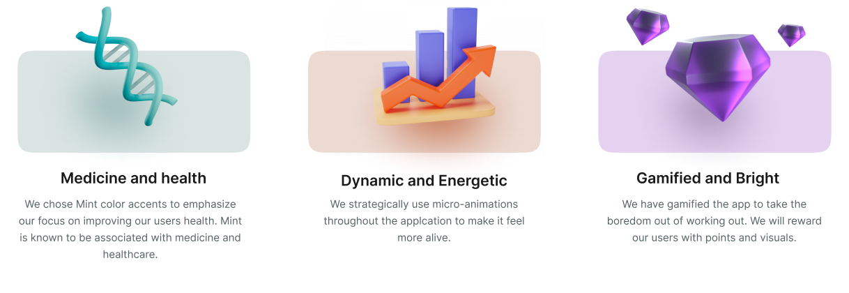
That is why we have created a design for the application that is meant to feel like a game. By keeping the game dynamic, light and fun we create a better experience for the user and increase the chance they come back. Here are the main themes that we put into the design:
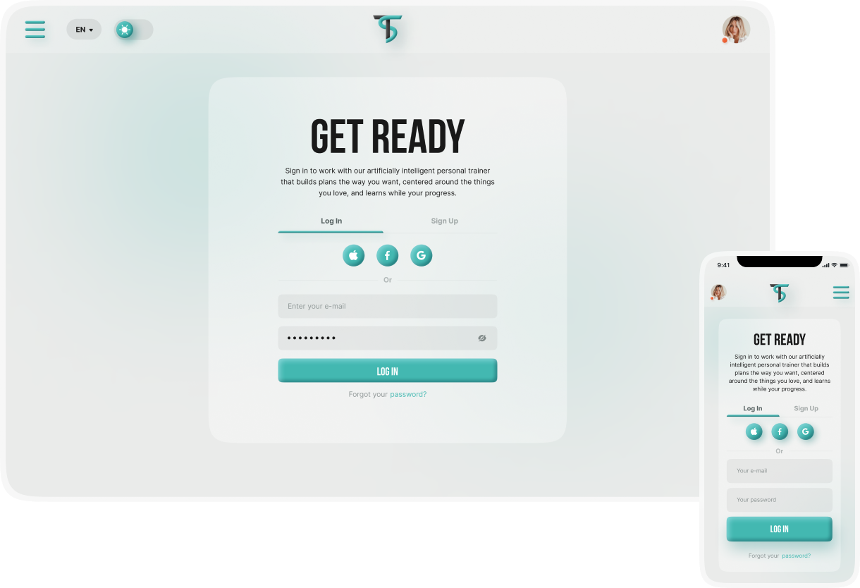
Log in | Sign up
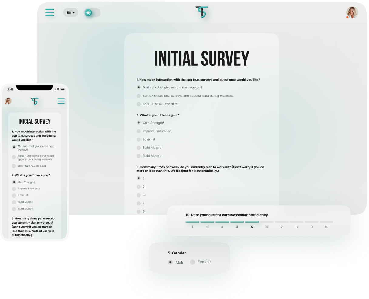
Onboarding: Tell the app about your fitness goals, conditioning, and preferences
Starting a fitness journey with Tr(ai)nStation toward achieving personal goals first necessarily requires a bit of setup, which primarily consists of the App collecting information, stats, and survey responses from the User. While best to avoid such processes during the first impression, in this case there was no way around it. The A.I. requires this basic information in order to start providing useful workout routines. So for Tr(ai)nStation, the goal was making the onboarding process as quick and painless as possible. Within these constraints, we focused ourselves on reducing friction in any and every way we could. Questions were broken up and simplified in a clean format to avoid a cluttered look or an "wall of text." Input fields were thoughtfully chosen and tested to be as intuitive to use as possible across mobile, tablet and desktop devices alike. By breaking the onboarding process into bite-sized steps, there was no bad taste left in the User’s mouth.
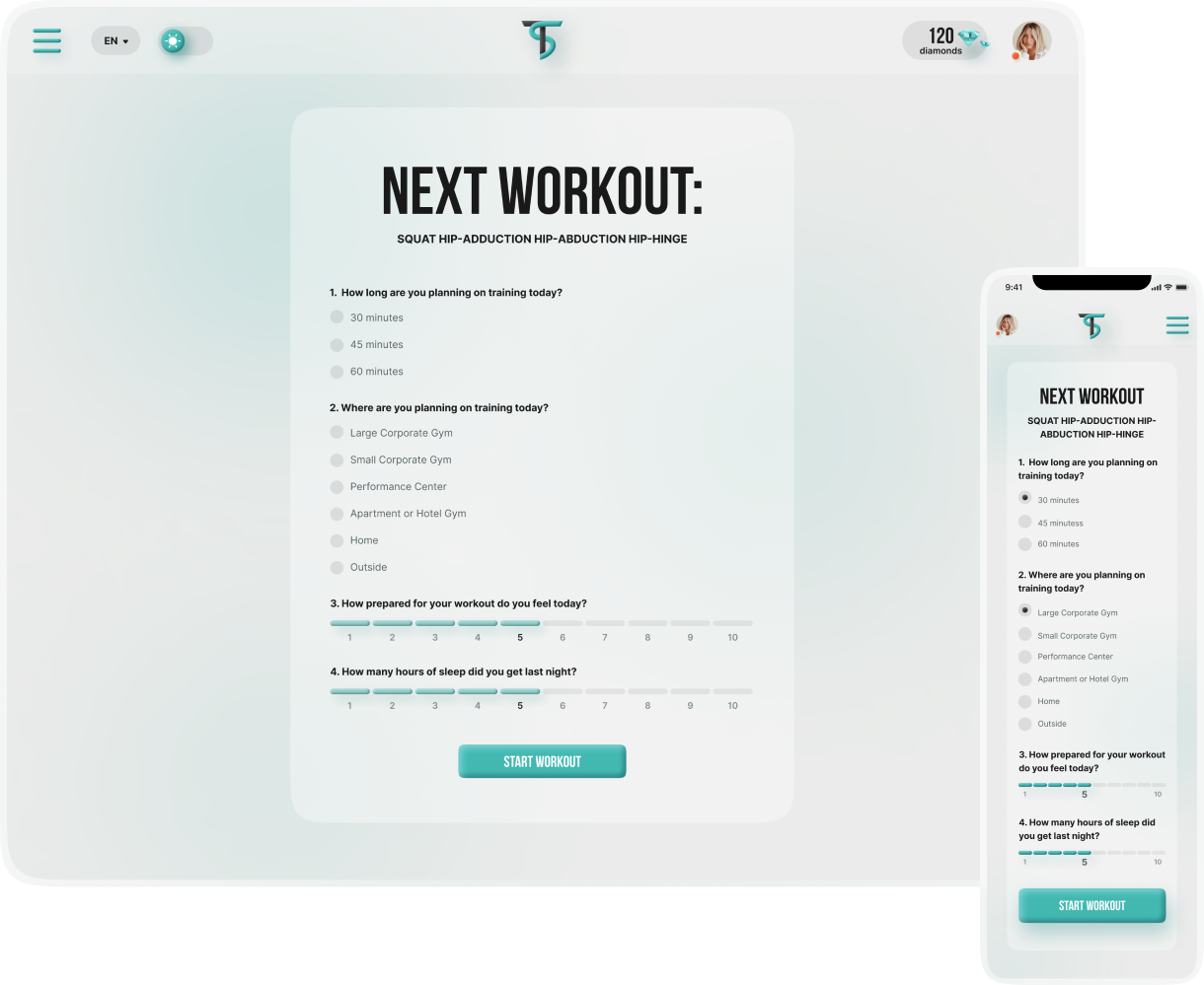
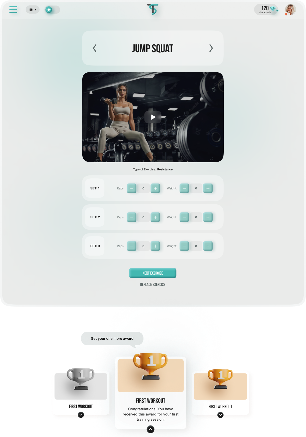
Next Workout
Each workout begins with a few simple questions
The App asks a few (strictly necessary) questions - each requiring only a tap of the finger - in order to instantly generate a unique workout for the day. If the User is not well rested, the algorithm takes this into account and produces a lighter day. At the same time, it carefully considers other workouts completed in the prior days to ensure maximum productivity.
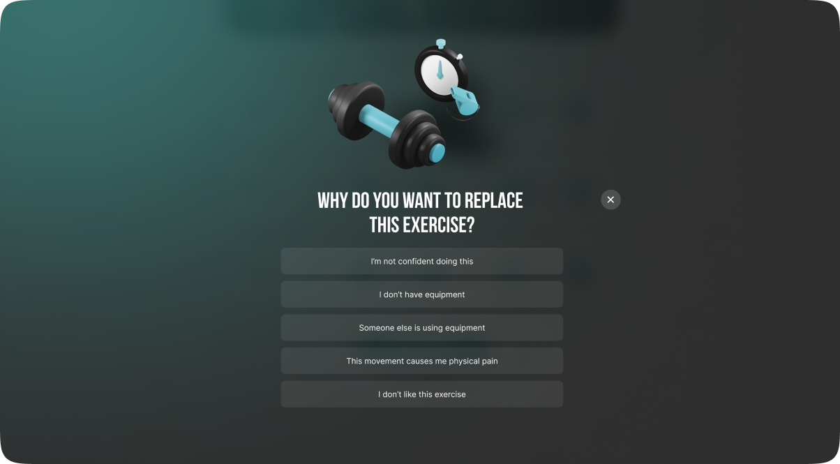
If for some reason you decide to skip an exercise, the application will ask you for a reason so that the artificial intelligence on the basis of which this application works can build the next workouts for the user in a better way
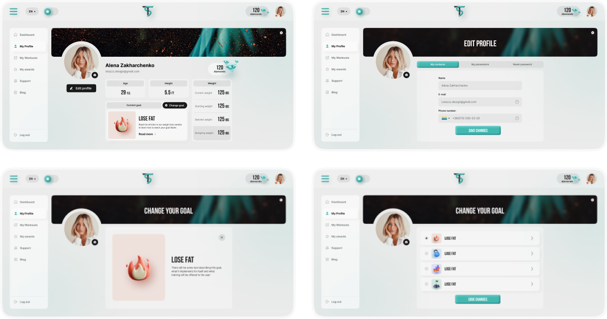
My profile
Profile management, personalization, and changing fitness goals
A simple, central and multifunctional interface on the My Profile page allows the User to updates settings and data, change banner images, and redefine fitness goals on the fly. We aimed for an interface so easy to use that these settings could easily be changed in the time between exercise sets!
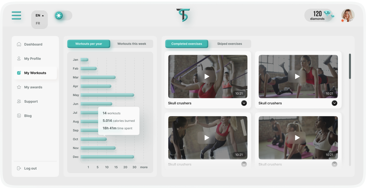
track an activity
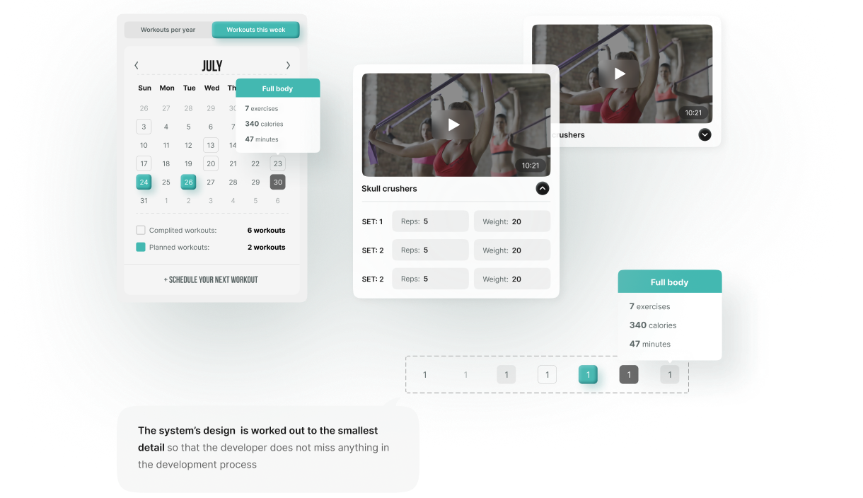
Intuitively track progress, and schedule new workouts
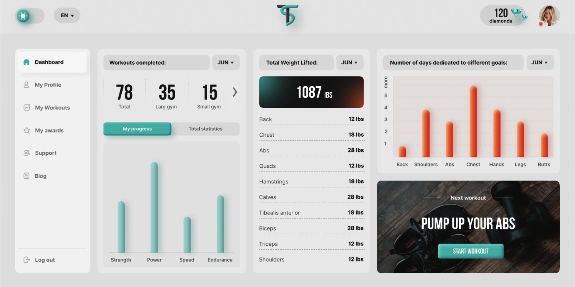
Positive reinforcement is vital for establishing durable behavioral habits, especially for things like exercise where physical results require a bit of time and determination before visually manifesting. Users are sure to get a motivational boost when they see their total calories burned, the number of workouts completed, and their time spent in the gym. This same section also provides and intuitive place to find the details of previously completed workouts, such as specific exercises done, number of sets, reps, weight, and more.
awards
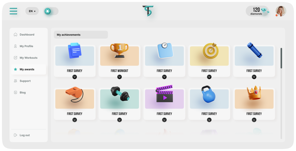
Rewarding the user with gamified incentives
Unlocking Achievements is a fascinatingly effective mechanism to keep Users on track with what they need to do. For a field like fitness, some simple gamification strategies went a long ways towards making Tr(ai)nStation feel fun and engaging rather than sweaty hard work!
theme
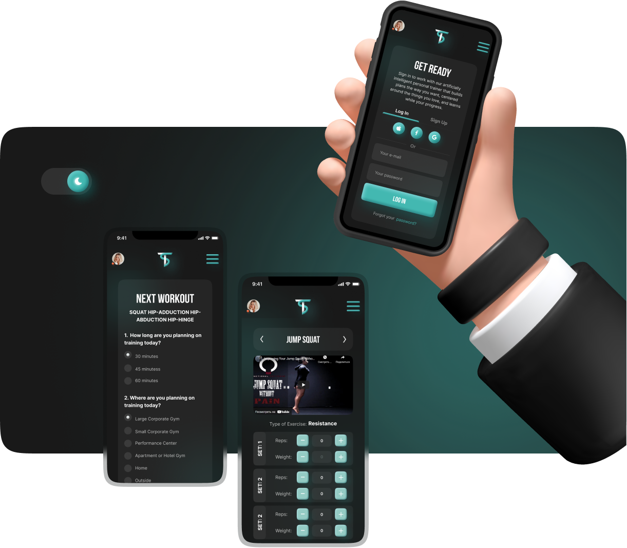
Dark Theme - a simple and powerful UI upgrade
Many folks have a strong preference for "Light Mode" or "Dark Mode" interfaces - even to the degree that it can be the deciding factor when choosing an app, website, or platform to use. With an organized and well-structured codebase, adding alternative UI theming does not necessarily require a lot of development time either. We thought it was a stylish and worthwhile addition to the Tr(ai)nStation App.
result
As a result, we got a convenient, exciting web application.
The task was to create a convenient, intuitive and attractive and exciting design for a fitness application that office workers of various companies and corporations will be happy to use.
- 40pages
- 3months
- 6people
Transform Your Vision – Let's Craft the Ultimate Solution
